
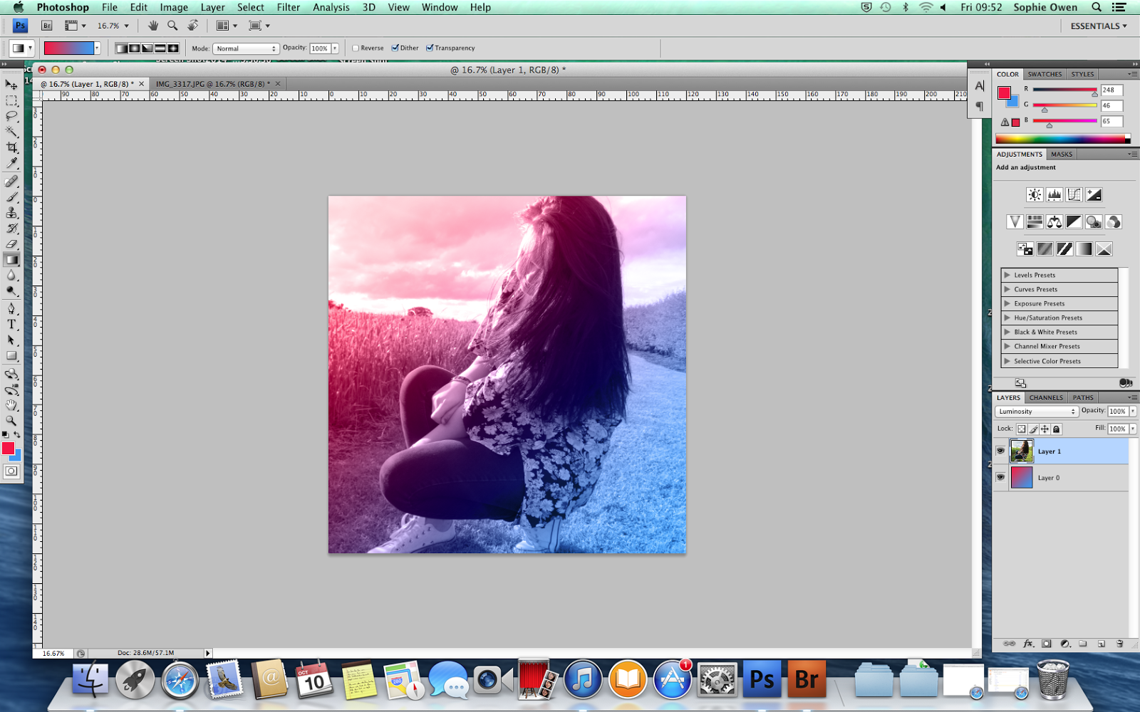
I started by adding this picture to photoshop and tried different effects until I found the one I liked. I also added a few different gradients to see which one looked the nicest.


I then added text on a new layer. I did this by spacing out the top 3 letters so that they fill out the same as the bottom 4.

I made the text thicker and changed the colour and put a different effect on it all. I also added 'Juxtaposition' to the bottom in a completely different font to create a 'juxtaposition' theme as they are so different.

I then tried some different effects


This is the finished front CD cover.
